HelloBeauts are advocates of feeling comfortable and powerful in your own skin, whilst educating their community around healthy beauty and skincare. I created their identity and brand guidelines that underpin the whole creative direction for all digital and analog creation.
Initial creative discovery
We set out by exploring what it is that represents HelloBeauts, what the brand stands for and then tied in everything to a brand vision and direction. This collation of research consisted of visual references and inspirational pieces, to tonal colour palettes, typography and beyond.
This was the creative discovery stage, bringing brain-stormed ideas together to further refine a strategic brand route.
Identity and colour
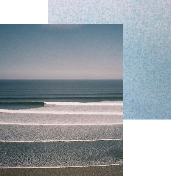
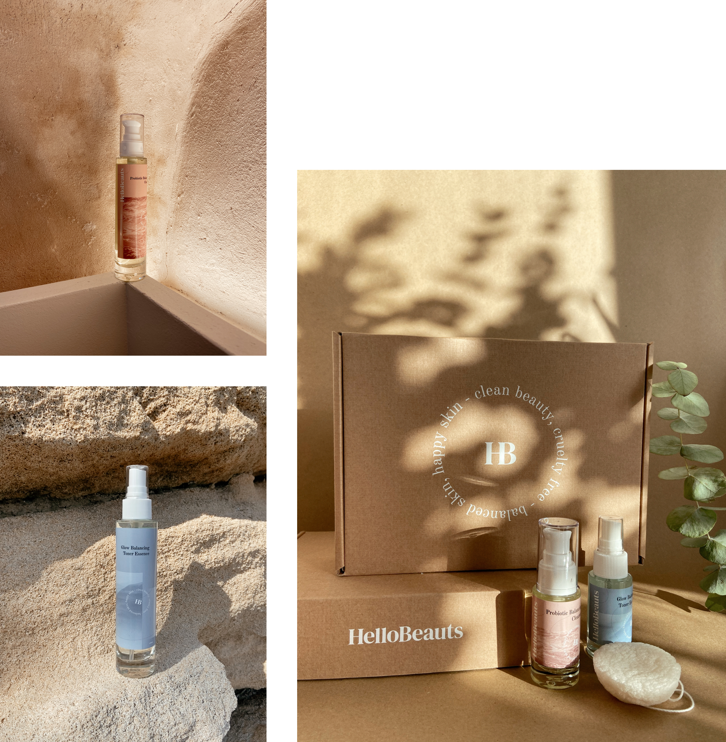
Both the logo and colour palette were focused on simultaneously to ensure that the overall identity communicated the way we wanted it to. We wanted to achieve a palette that nods to the raw textures, materials and ingredients of skincare products, whilst referencing other visual elements that inspire HelloBeauts.
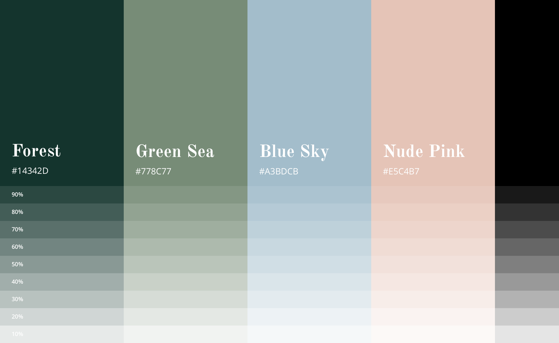
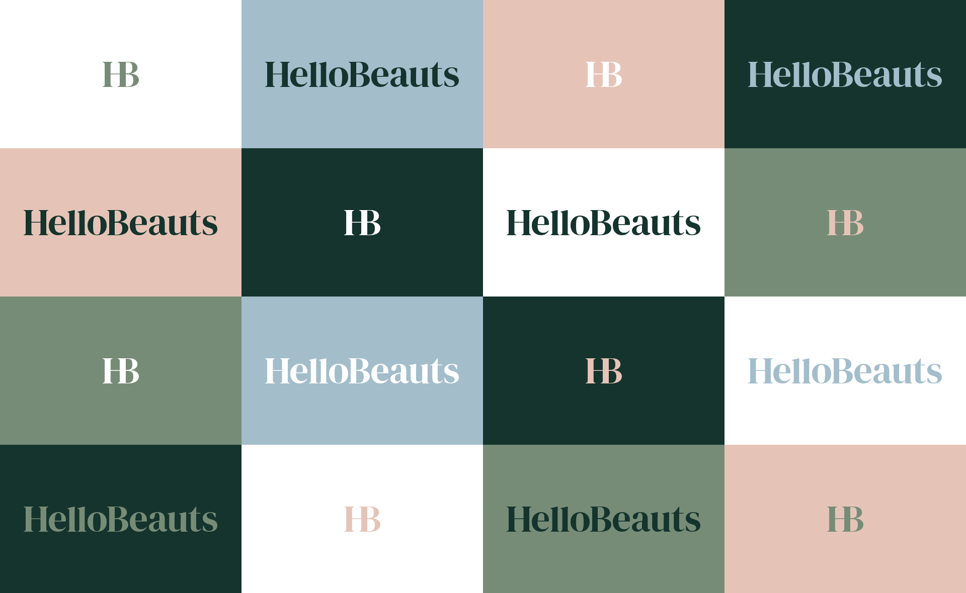
The curated palette consists of Green Sea, Blue Sky, Nude Pink and Forest. I also created eligible colour pairings in different variations based on the scenario of usage.
Forest
Inspired by the natural untouched landscapes of earth, that are full of rich and varying hues of green. It creates a sense of depth and maturity.


Green Sea
The Mediterranean sea has a soft green glow, especially in the blistering sun and it definitely resonated with the origins of HelloBeauts.
Blue Sky
Another inspiration were summer days where the sky is a subtle gradiented blue with a grainy haze.
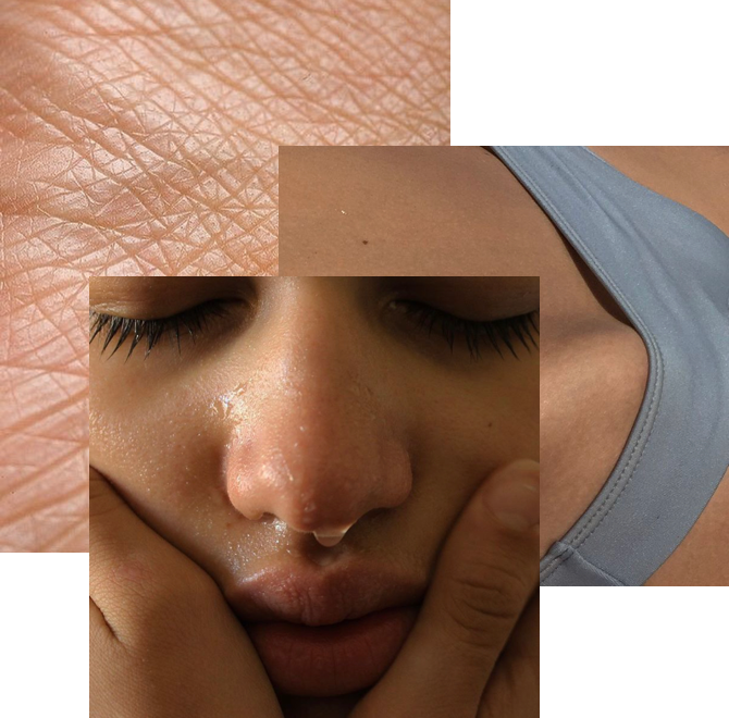
Nude Pink
Inspiration for this colour came from many different skin tones and the organic texture.
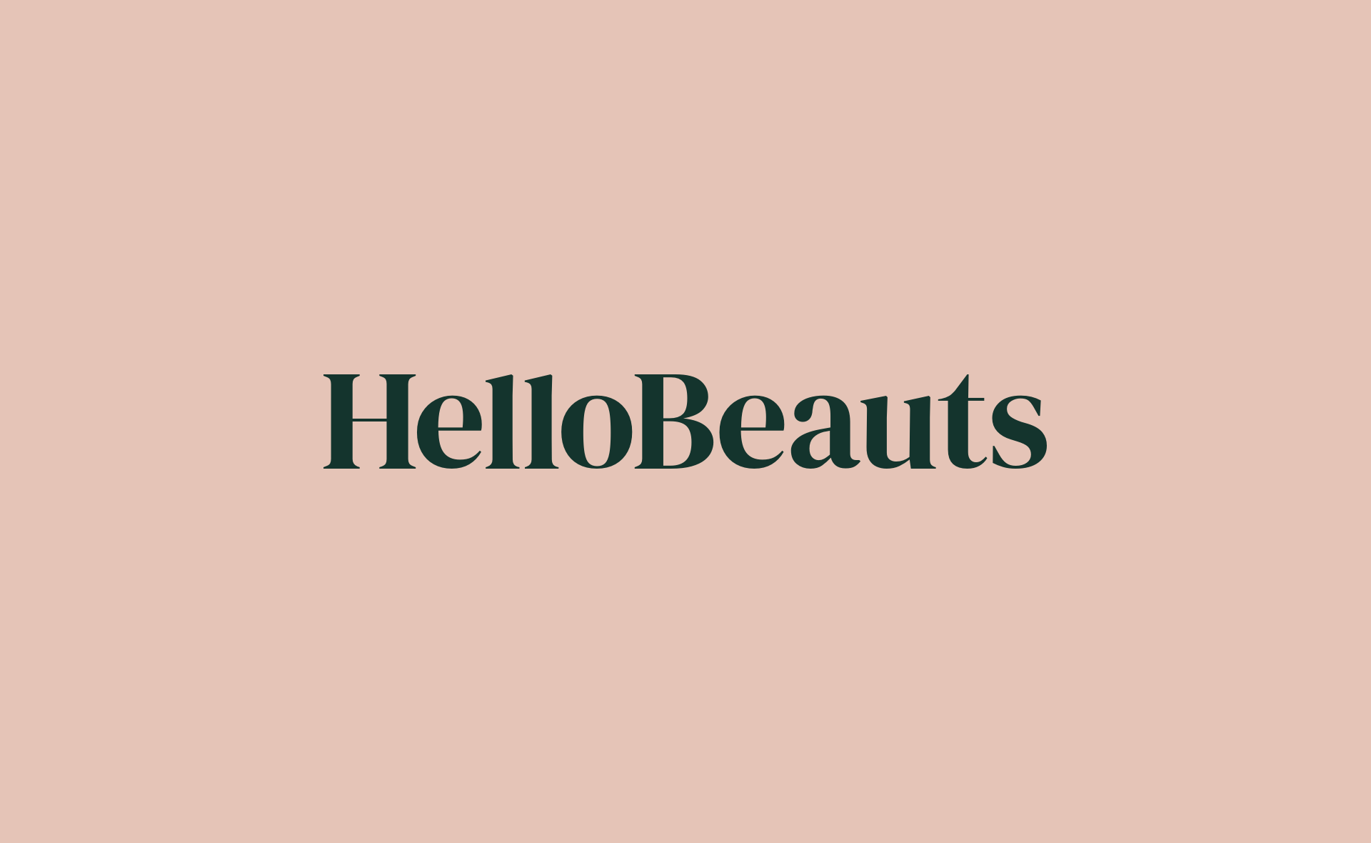
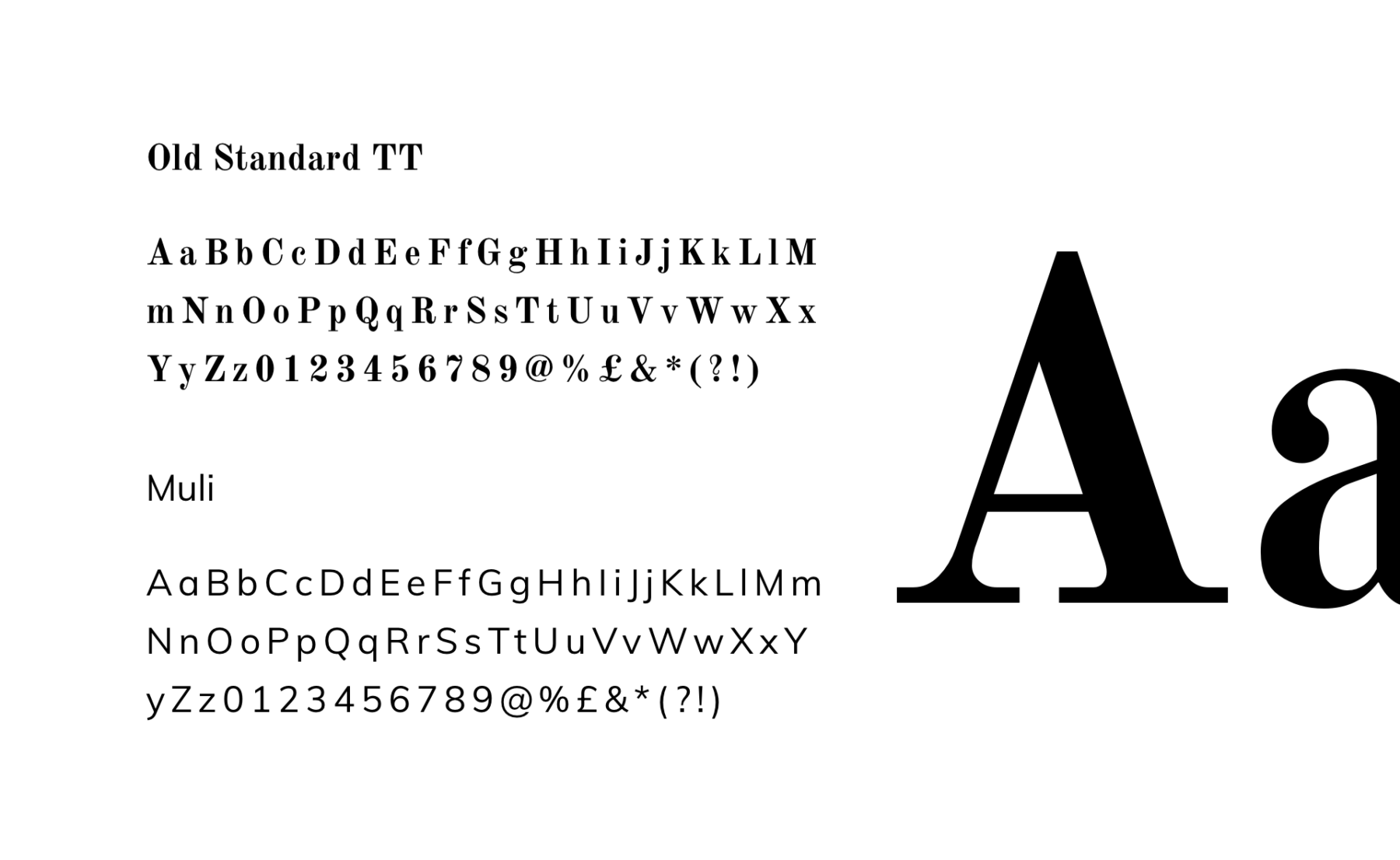
Identity construction
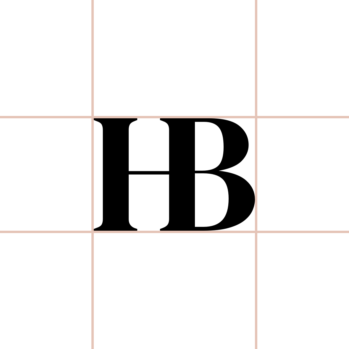
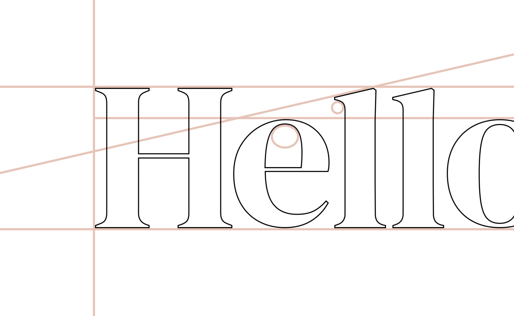
We opted for an elegant bold typeface for the identity. Something that would be eligible and render well in a digital environment. We chose DM Serif for the typeface and made microscopic structural changes to the letters for the logo.
I cleaned up the characters so they all became consistent in shape, form and angles, then focused on a balanced letter spacing. The condensed 'HB' variation was brought closer together, to become a symbolic mark of the full HelloBeauts logo.
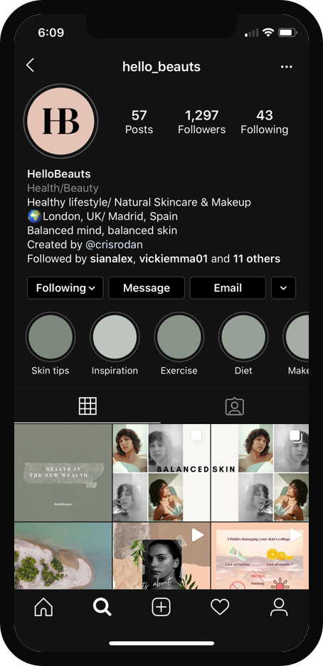
Implementation of identity
I created two variations of the logo, default and condensed, which avoids any eligibility problems when using the logo. For example, the condensed 'HB' sits perfectly in a small circular profile icon space, remaining clear and easy to view. This goes for any brand presence across various digital platforms, from website, social media to marketing and print.

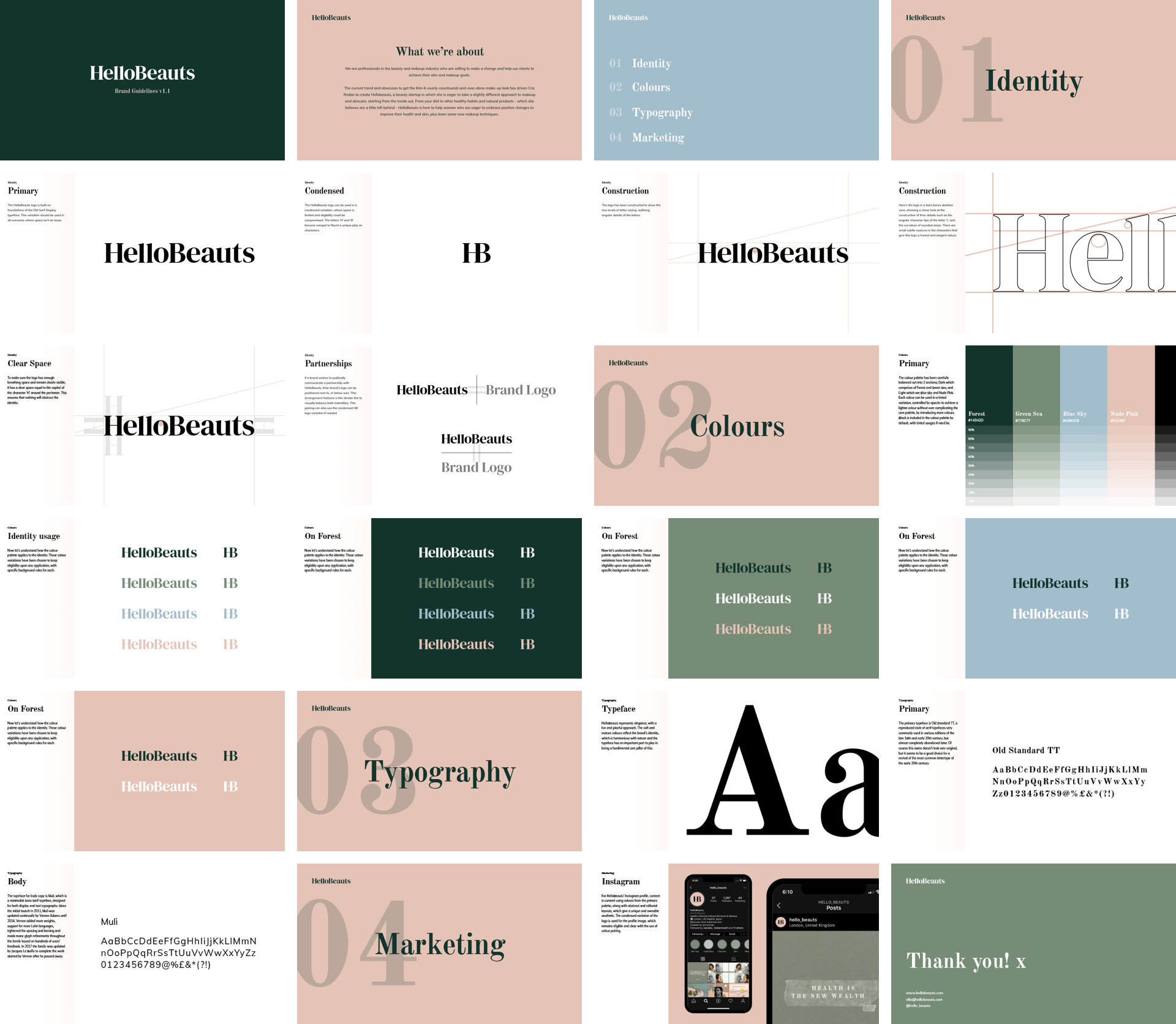
Creation of brand guidelines
We finally created and brought to life the brand identity for HelloBeauts. I then brought everything together in the form of a brand guidelines document, that will continue to evolve simultaneously with the brand.
An overview of the brand guidelines document is below.